Etsy Listing Page UX Redesign
As being a seller on Etsy for years, I have experienced how Etsy’s current listing page is causing issues on Customer’s experience.
I have redesigned the area that’s causing the most problem on CX.
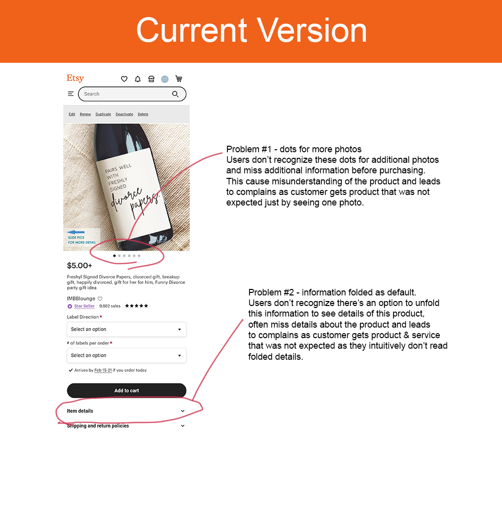
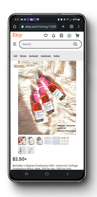
CURRENT VERSION
ISSUE WITH THE CURRENT VERSION
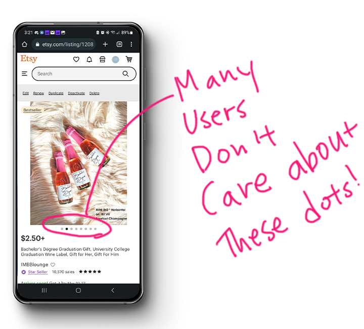
Many users don’t read full description & detail instruction about the item & making order. So sellers figured it may catch their attention easier to have it in a photo format and add it as additional photos. Current version shows small dots below the photo to let users know there are additional photos and they can slide to see the next photo. BUT, many of customers don’t recongnize these dots and easily assume there’s no more of additional photos. Customers happen to lose the opportunity to see details on the product and H&S information before they decide to submit an order.
Since they have missed the detail information they should have known before purchasing, customer inquiries & complain rate increases – which lead to customer unsatisfaction and gives huge impact on sales.
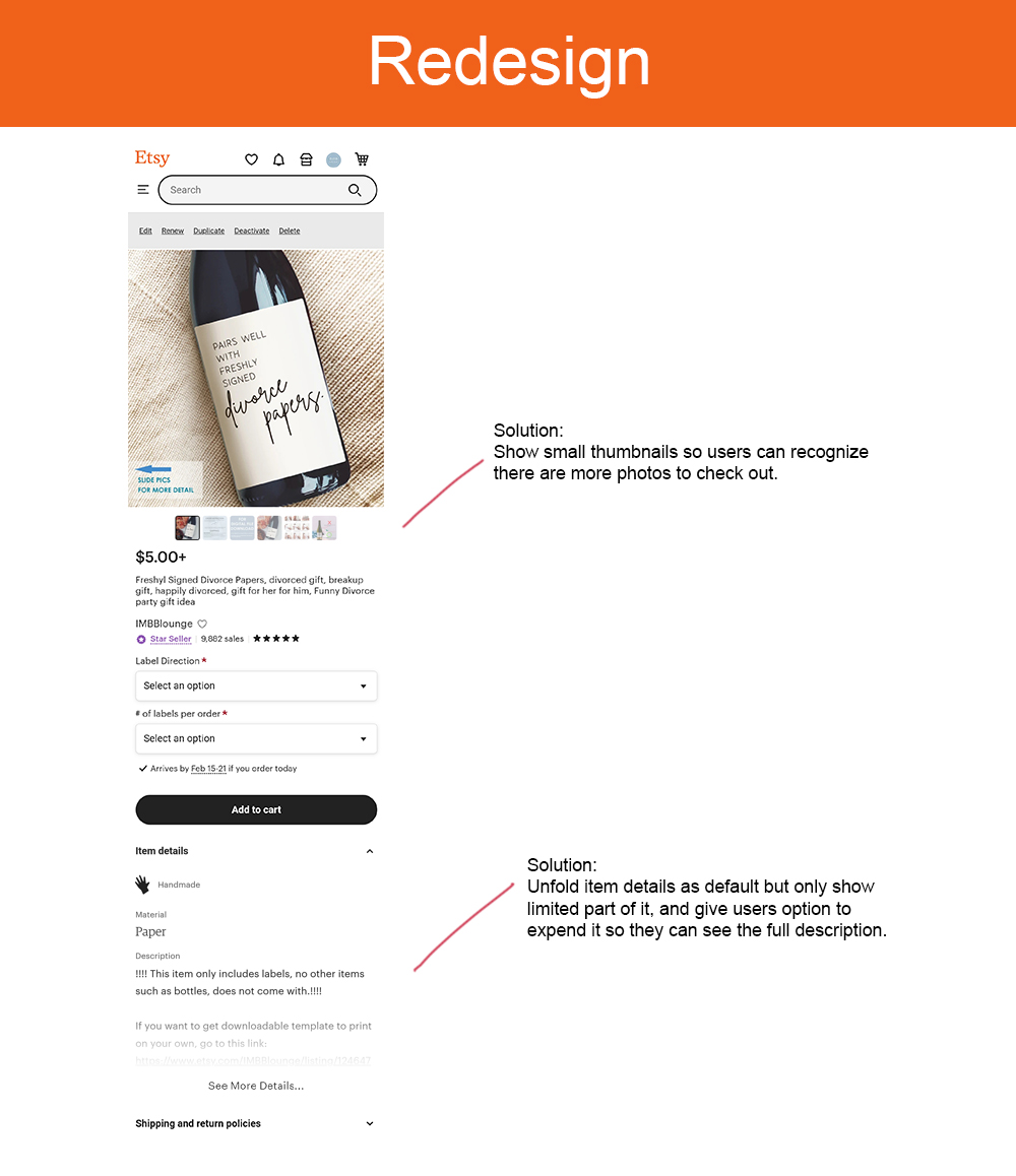
SOLUTION
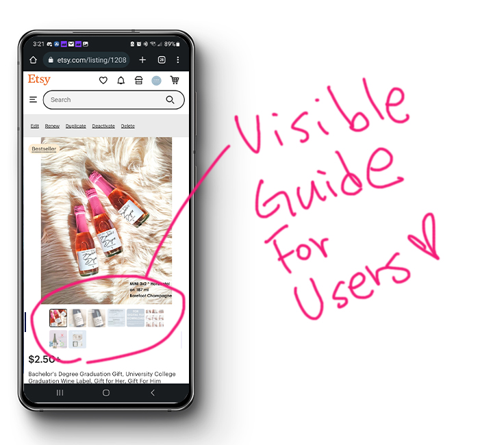
Showing small thumbnails instead of dots will help customers to recognize there are more photos they needs to check out.